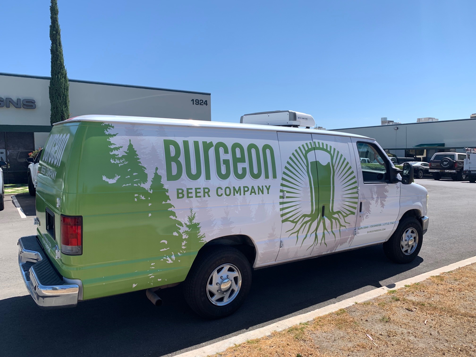
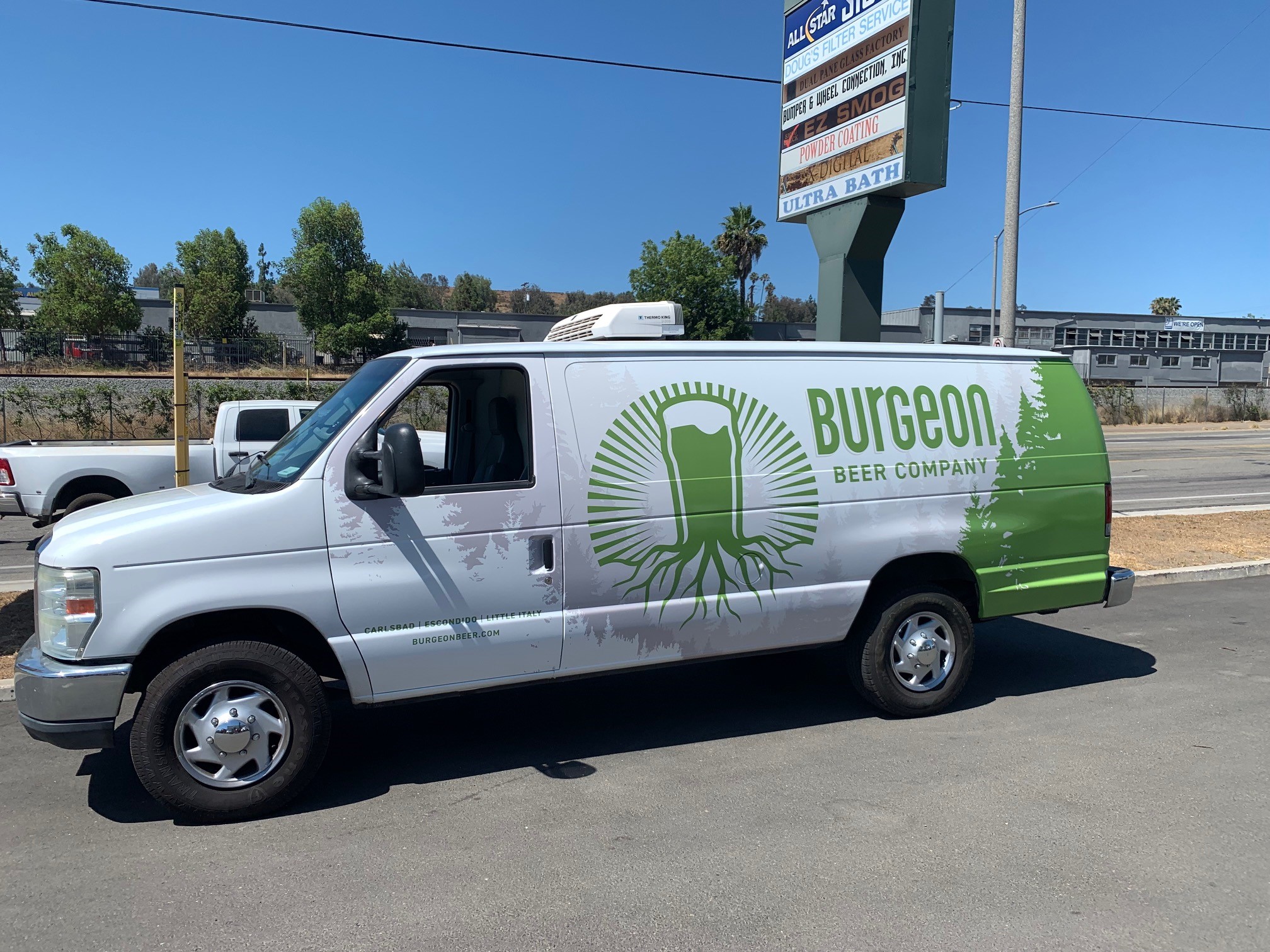
Last year, All Star Signs had the opportunity to work with the Burgeon Beer Company on the design, production, and installation of channel letters. Next, we helped the client develop fleet vehicle graphics advertising its presence in San Diego County. Our most recent project had us tackle custom van graphics in Carlsbad, CA.
Boosting the Brand Story with Underlying Images for a Bold Look
Taking a look back at the work we have already done for this client, it is clear that they are not afraid of featuring their brand story from a variety of angles. For example, you will notice that their box truck wraps display gradient color changes with different tones. It is, therefore, not surprising that the client had new ideas for the direction of the van graphics.
Rather than going with gradient color changes, this graphics product features only one green tone. However, what is unusual, is the design of underlying graphics. Light gray images suggest the display of a forest. Our graphic artist developed the look with highly-detailed background and middle ground images. The finished product focuses on the logo, which replicates roots, and then continues this aspect of the brand story with other graphics playing on this idea.
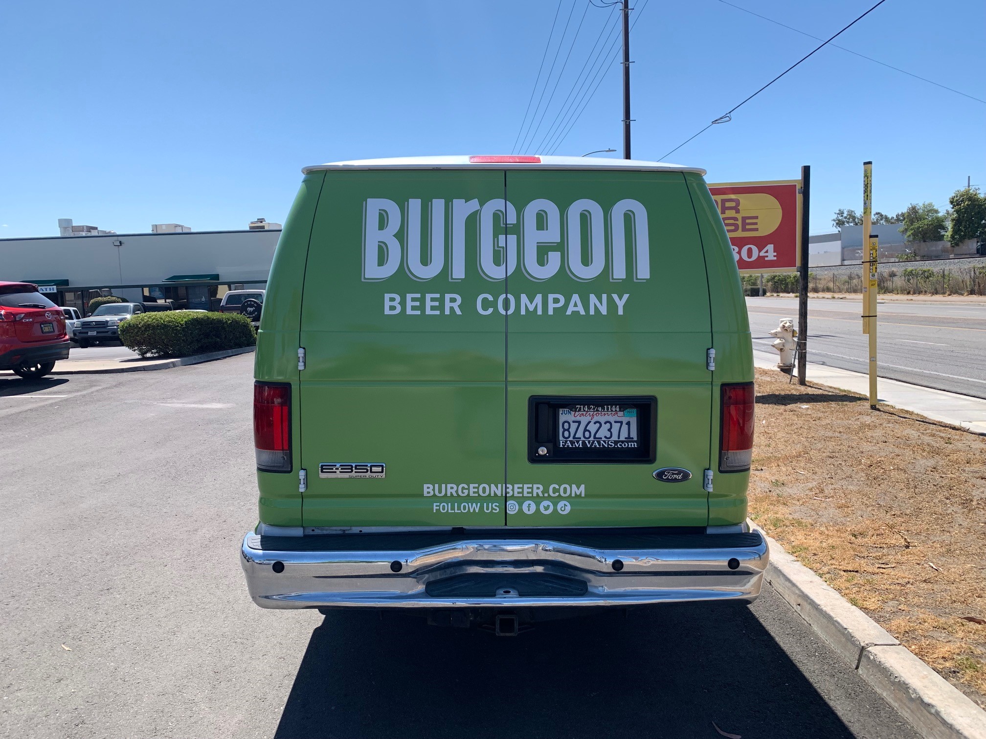
The van looks great, functions as eye candy, and gives customers various ways to connect with the company.
How Important is the Color Continuity within a Fleet of Vehicles?
You have undoubtedly heard us say that having perfectly matched colors for your signage solutions is critical. Of course, then you see the graphic designs we put together for the Burgeon Beer Company, and you are not sure what this means. So, what does color continuity mean?
Color continuity is the element of your brand that defines a palette. You select the colors you like and note their names and mixing instructions. As a result, whenever you need to have a sign made, our technicians work with these specs to create a project that does not move away from the color play.
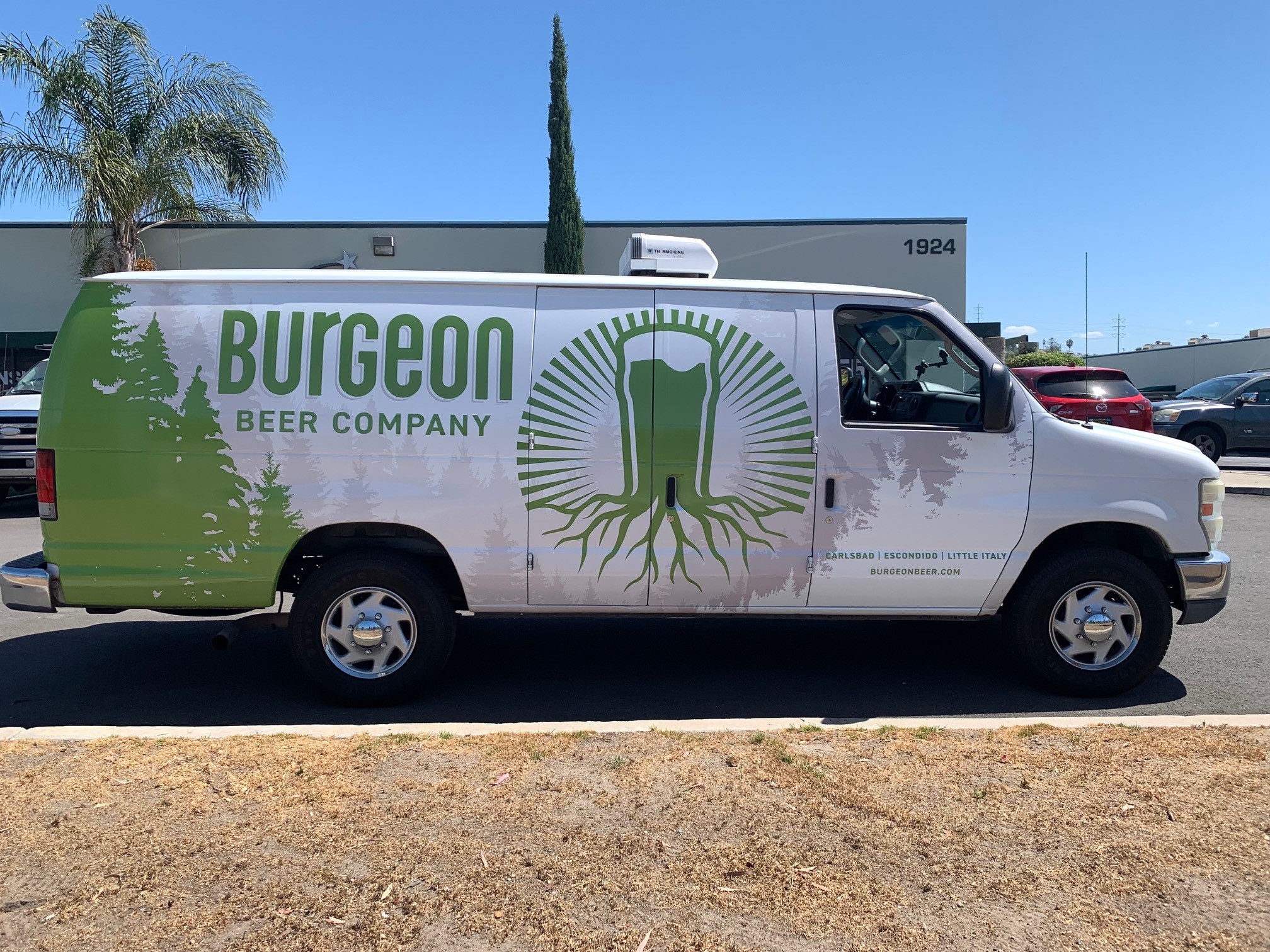
In contrast, the practice of planning different color expressions nevertheless emphasizes an identical corporate persona. In this case, it refers to the logo, letter font, and element spacing. While these colors are vastly different, they are a part of the brand’s palette option. Most importantly, it underscores the brand’s unique quality and character.
Ordering Your Truck Wraps, Auto Lettering, and Van Graphics in Carlsbad, CA
How can we help your company present its brand story with a movable billboard? Vans, trucks, and cars are ideal for bringing your advertising or branding to customers wherever they may be. Rather than leaving message exposure to chance, you can target the consumer in their residential neighborhoods, near their workplaces, or anywhere else they may be.
We can work with you on designing a fleet presentation that perfectly encapsulates your brand message. Another option is to begin with one vehicle and gradually add to your fleet graphics as you bring in more cars. Discuss your plans with our graphic artist today!
