![]() Designing ADA-compliant signs for government buildings is essential to ensure accessibility and inclusivity for all visitors. These signs help people navigate complex buildings while meeting legal requirements set by the Americans with Disabilities Act (ADA). This act mandates that signage is easy to read and understand, providing equal access to information.
Designing ADA-compliant signs for government buildings is essential to ensure accessibility and inclusivity for all visitors. These signs help people navigate complex buildings while meeting legal requirements set by the Americans with Disabilities Act (ADA). This act mandates that signage is easy to read and understand, providing equal access to information.
In government settings, ADA signs serve as critical tools for communication. They guide the public and employees, ensuring everyone can find their way efficiently. Properly designed signs not only meet regulatory standards but also enhance the overall experience by making spaces more welcoming and functional.
Crafting effective ADA signs requires attention to detail and an understanding of key elements such as font size, color contrast, and tactile features. By carefully considering these factors, designers can create signs that offer clarity and accessibility, fulfilling the needs of diverse users. This article explores the essential components and best practices for designing ADA-compliant signs in government buildings.
Understanding ADA Signage Requirements for Government Buildings
Creating ADA-compliant signs for government buildings involves understanding specific requirements outlined by the Americans with Disabilities Act. These guidelines focus on ensuring accessibility for individuals with disabilities, including those who are blind or visually impaired. Key requirements cover the placement, readability, and tactile features of the signs.
First, consider sign placement. ADA signs must be located at specific heights and positions. Typically, signs should be mounted between 48 and 60 inches above the ground to ensure they are within reach. Signs identifying rooms should be placed alongside the door on the latch side to remain consistent and easily locatable by touch.
Readability is another critical factor. The text must be presented in a sans-serif font with high contrast between the text and background, ensuring clarity. Characters need to be at least 5/8 inches tall but no larger than 2 inches to remain easy to read from a reasonable distance.
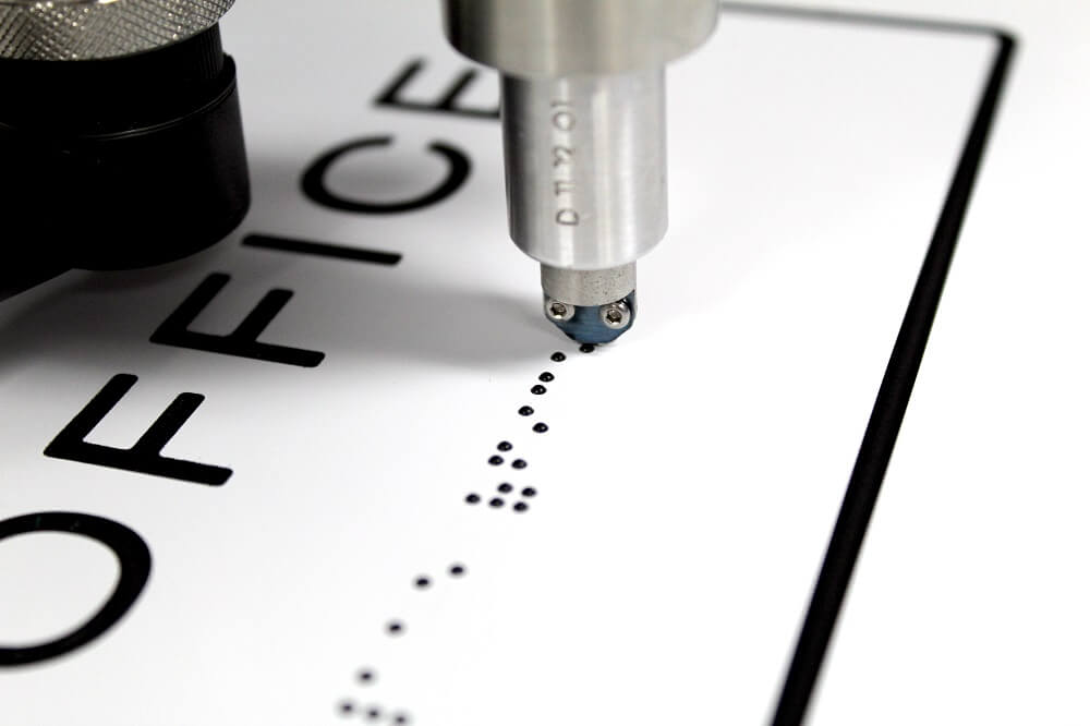
Tactile elements like Braille are essential for compliance. Raised characters should accompany Braille translations at the bottom of the sign. The spacing between characters and lines must allow for easy tactile reading. Understanding and applying these elements help in complying with ADA standards and ensuring that government facilities remain accessible to all visitors.
Key Elements of Effective ADA Signs
Designing effective ADA signs requires incorporating key elements that enhance accessibility and usability. By focusing on these features, you can create signs that are both functional and compliant with ADA standards.
1. Readable Fonts: Use sans-serif fonts, which are easier to read for individuals with visual impairments. Ensure characters are a minimum of 5/8 inches and no more than 2 inches in height.
2. Color Contrast: High contrast between text and background is crucial. This helps visually impaired individuals distinguish the information quickly. Pair light and dark colors for optimal visibility.
3. Tactile Features: Include raised text and Braille to cater to blind users. Raised characters should be 1/32-inch above the background. Braille dots must be rounded and follow specific spacing guidelines to be effectively read by touch.
4. Non-Glare Finish: Signs should have a matte or non-glare finish to prevent reflections that can obscure text, making it difficult for people with certain visual impairments to read them.
5. Pictograms: When using symbols, ensure they are easy to understand and accompanied by text descriptions below. Keep pictograms in a 6-inch field, separate from other elements.
By integrating these elements, you ensure that ADA signs in government buildings provide clear, accessible information to all individuals, fostering an inclusive environment.
Best Practices for Designing ADA-Compliant Signs
When designing ADA-compliant signs for government buildings, following best practices ensures clarity and effectiveness. Start by choosing durable materials, such as acrylic or metal, that can withstand frequent use and cleaning, minimizing the need for frequent replacements.
Incorporate consistency in design throughout the facility. This involves using uniform colors, fonts, and symbols, which helps users identify and understand the signs quickly. Consistency reduces confusion and enhances the usability of the signage system.
Make sure to use precise and concise wording on signs. Clarity in language reduces misunderstanding and helps all visitors navigate the space with ease. Avoid overly complex words and phrasings.
Consider the use of technology to enhance accessibility. For instance, integrating QR codes that connect users to digital navigation tools can provide additional assistance, especially for visitors who might need extra guidance.
Ensure that each sign’s tactile elements are accurately placed and meet ADA specifications. Conduct regular reviews of designs before and after production to catch any discrepancies early. By incorporating these best practices, designers and facility managers can create an ADA signage system that supports and enhances accessibility throughout government buildings.
Implementing ADA Signage: Installation and Maintenance Tips
Proper installation and maintenance of ADA signage play crucial roles in ensuring ongoing compliance and functionality. Begin by hiring experienced professionals for the installation process. They should understand the ADA guidelines to ensure signs are mounted at the correct height and location according to regulations.
Create a maintenance schedule to regularly check the condition of the signs. Routine inspections prevent wear and tear from becoming a compliance issue. Check for any damage like fading or peeling, which may affect readability, and replace signs promptly if necessary.
Pay attention to cleaning methods. Use non-abrasive cleaners that won’t damage the surface of tactile elements like Braille or raised text. Regular cleaning keeps signs looking sharp and maintains their effectiveness.
Incorporate feedback loops with building users to identify areas where signage might be lacking. This can involve listening to visitor comments or conducting surveys to improve placement or visibility.
Develop a future-proofing strategy. As regulations and building functions evolve, ensure that your signage can be updated without needing complete replacements. Modular sign designs allow for easy updates and reconfigurations as needed, keeping your facility compliant over time.
Conclusion
Ensuring that government buildings have effective ADA signage is not just about meeting legal obligations; it’s about fostering an environment where everyone feels welcome and can navigate easily. By understanding requirements, focusing on key design elements, and applying best practices, you can create a navigational system that provides clear guidance and enhances visitor experience.
ADA signs play a vital role in making government buildings accessible to all. Implementing thoughtful designs and maintaining them properly shows a commitment to inclusivity. This dedication to accessibility reflects positively on the organization and helps build trust with the community.
If you’re ready to improve accessibility in your government building with ADA-compliant signage, consider reaching out to All Star Signs. Our team is dedicated to helping you design, install, and maintain signs that meet your needs and the requirements of the ADA, ensuring your space remains accessible and welcoming for all visitors. Contact us for signage installation.