Intersection provides property management services at 156-190 South Rancho Santa Fe Road. There, a variety of unique businesses opened up in a quaint shopping center. To boost visual aesthetics and upgrade the appearance of the venue, the firm asked our sign shop to refurbish and replace its commercial property management signs in San Marcos, CA.
Comprehensive Signage Suite Approach Increases Curb Appeal
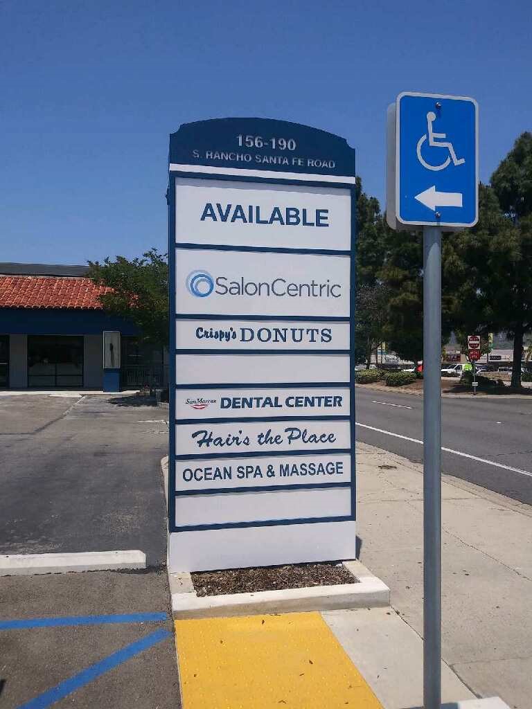
We worked with the client and received the specs for the various signage projects.
- Refurbished pylon sign. The existing monument sign was in excellent repair. It only needed an upgrade. Therefore, we renovated the San Marcos Square sign with new paint and custom imprinted Lexan facings.
- Paint. Areas behind the distinctive business signs needed a color upgrade to match the new tone of the monument. We painted these areas and made minor façade repairs.
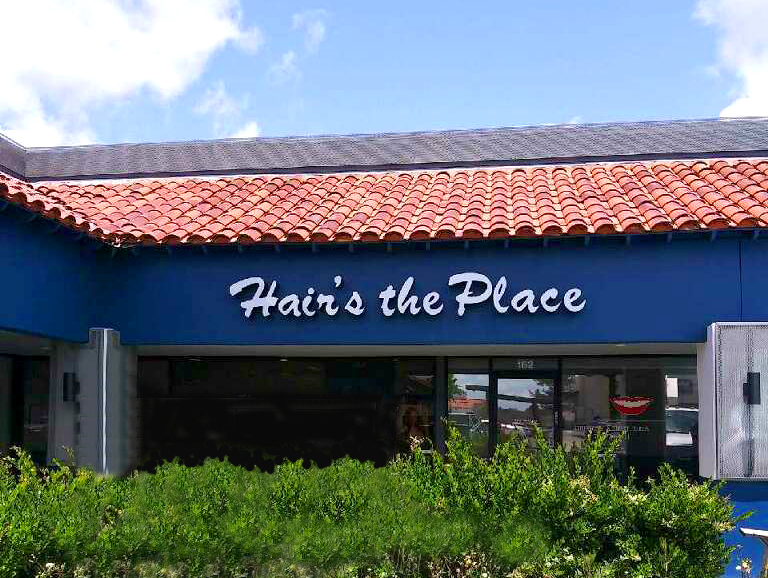
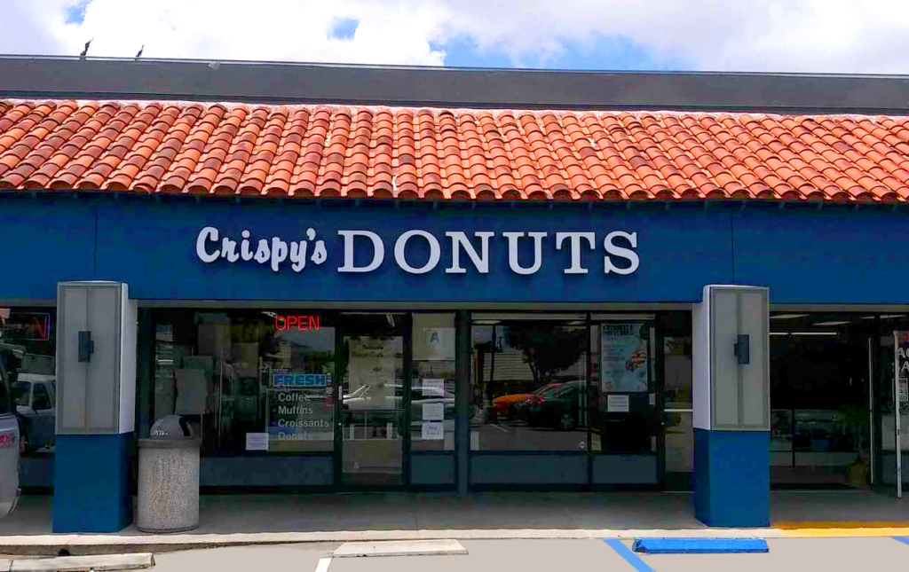
- Channel letters. Finally, we manufactured backlit channel letters for each business. Each set of letters was unique to the font and presentation that the business owner had selected. Even so, the consistent design approach to the lettering creates a cohesive presentation that ties the look together.
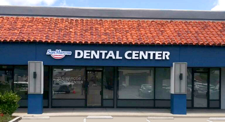
Now, the shopping center impresses with a fresh coat of paint that contrasts beautifully with the Spanish tile of the roofing. Besides that, the newly refurbished monument sign is inviting and attracts customers to enter for an impulse stop.
Upgrades to Shopping Center Signage Pay Huge Dividends
Visual upgrades to San Marcos area shopping centers are instrumental in attracting new customers. Shoppers are becoming more discerning. At the same time, many of the commercial venues are now reaching an age that results in a dated appearance.
It turns off many millennials. Besides that, it may make it difficult to rent out open spaces. As you can imagine, having many vacancies is problematic for any management company. It also detracts customers from shopping.
In contrast, having an upgraded appearance makes a huge difference. It shows that you provide hands-on management of the facility. This makes it attractive to prospective tenants. Additionally, shoppers are attracted to venues that look neat, clean, and showcase a fresh coat of paint. Most importantly, all the signage is on point, functioning, and combines with easy-to-see entry markers.
Possible Upgrades Your Shopping Center Could Benefit From
What signs do you still lack? Maybe some of the signs you currently have on site are tired and worn out. Perhaps the California sun has taken its toll on the products, and they reached the ends of their useful lives. Our sign shop can help you with all aspects of a shopping center signage suite.
If you need channel letters in San Marcos, CA, we gladly assist with new designs or recreate existing presentations. For lightbox cabinets, it typically only requires a facing upgrade and coat of paint for the box itself. Monuments and pylons also do very well with upgraded paint and facings. Some shopping centers may need ADA parking signage and similar markers to boost customer convenience.
Find out more about your options with a quick call to our sign shop!
