We live in a very competitive business environment. For every entrepreneur, brand awareness should be a top priority. Many practices can help us highlight our brands, but only a few are truly effective.
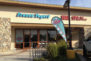
Branding extension is a very debated topic, and many marketers agree that, when it comes to maximizing our brand, this is the best approach. Placing graphics signs on certain exterior touchpoints is a productive idea which will attract your target clientele.
Even though this practice seems simple in theory, there are some aspects that we need to consider before designing such signs.
In the following, we will tell you more about it and also present some sign and visual graphics ideas for common exterior branding challenges.
If You Want to Draw People’s Attention
In the past, it was easy to attract a passer with a nice logo and a big sign. Today, this is not so simple because there are too many distractions and people tend to ignore most of them.
If you want to grab someone’s attention, you need to break the pattern and design something that’s both expressive and graphically engaging. The best approach is to present your brand in a simple but descriptive manner, mentioning your top services.
For example, if you run a pizza place, you can opt for a big banner with a steaming pizza, including some key information about your business. The description shouldn’t exceed 50 words, and it should contain things like: minimum price, what makes your product unique, certain promotions and some additional facilities (home delivery, free refills, etc.).
If The Physical Space Is Limited
Nowadays, space is a big issue. If you’re running a tiny store, your budget is probably tight and you cannot afford to rent a large space. But that isn’t a problem. With a well designed graphic banner, you’ll be able to make a good impression and to boost your brand’s exposure.
Let’s say that you own a small electronics store, but the physical space is limited . You can place some graphic banners outside the store, but they won’t be effective since the space is so small. The best approach here is to opt for pole signs.

The Magic of Pole Signs
Pole signs can be costly but they will ensure a better brand exposure, being visible from miles away. When it comes to pole signs, the golden rule is to be concise. Limit your description to 30 words and try to be as descriptive as possible.
For example, the pole sign should contain a background picture of popular products and a call to action message like, “Purchase your favorite device today! Lowest prices that you’ll ever see!” Everybody needs one of these devices and now they will all know that your store has them, and offers them for a low price.
All Star Signs Inc.
If done properly, exterior branding can do wonders for your company and substantially increase your sales levels.
All Star Signs Inc. is the best choice for providing interior and exterior signage, and much more. Contact us today. Our exterior graphics will work for you day and night, ready to tell your business’ story and make everybody eager to visit your store.
